The Circle | Data visualizations
A project by Federica Fragapane
Instagram: instagram.com/federicafragapane
"The Circle" was an exhibition dedicated to photographer Luca Locatelli's exploration of circular economy solutions. Curated by Elisa Medde and presented at Gallerie d'Italia, Turin. To enrich and strengthen the exhibition's strong educational character, I have designed five printed data visualization pieces and an interactive screen developed by Paolo Corti. These works accompany the exhibition journey to explore the rich, complex, and vital data related to the urgent topics of climate change and circularity.
The Circle was on show at Gallerie d'Italia in Turin from September 21st 2023 to February 18th 2024.
A project by Luca Locatelli, exhibition curated by Elisa Medde.
Architectural project by MYGG architecture, visual identity and graphic by Leftloft, catalogue design by Skira editore.
Interactive screen developed by Paolo Corti.
Proofreading and editing by Veronica Vannini.
Data visualizations designed by Federica Fragapane.
The data visualizations
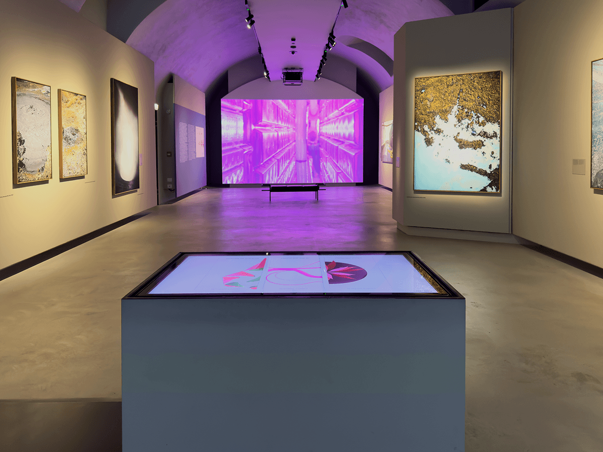
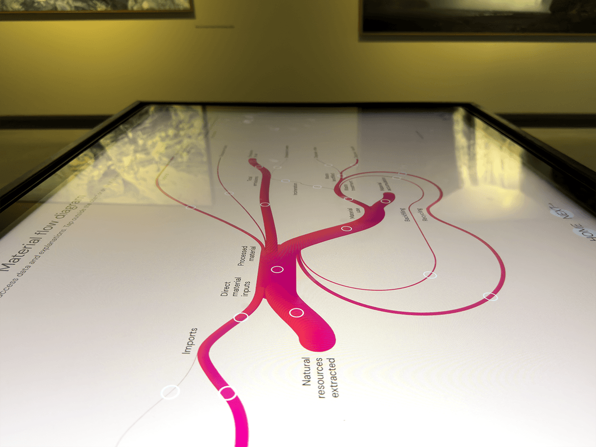
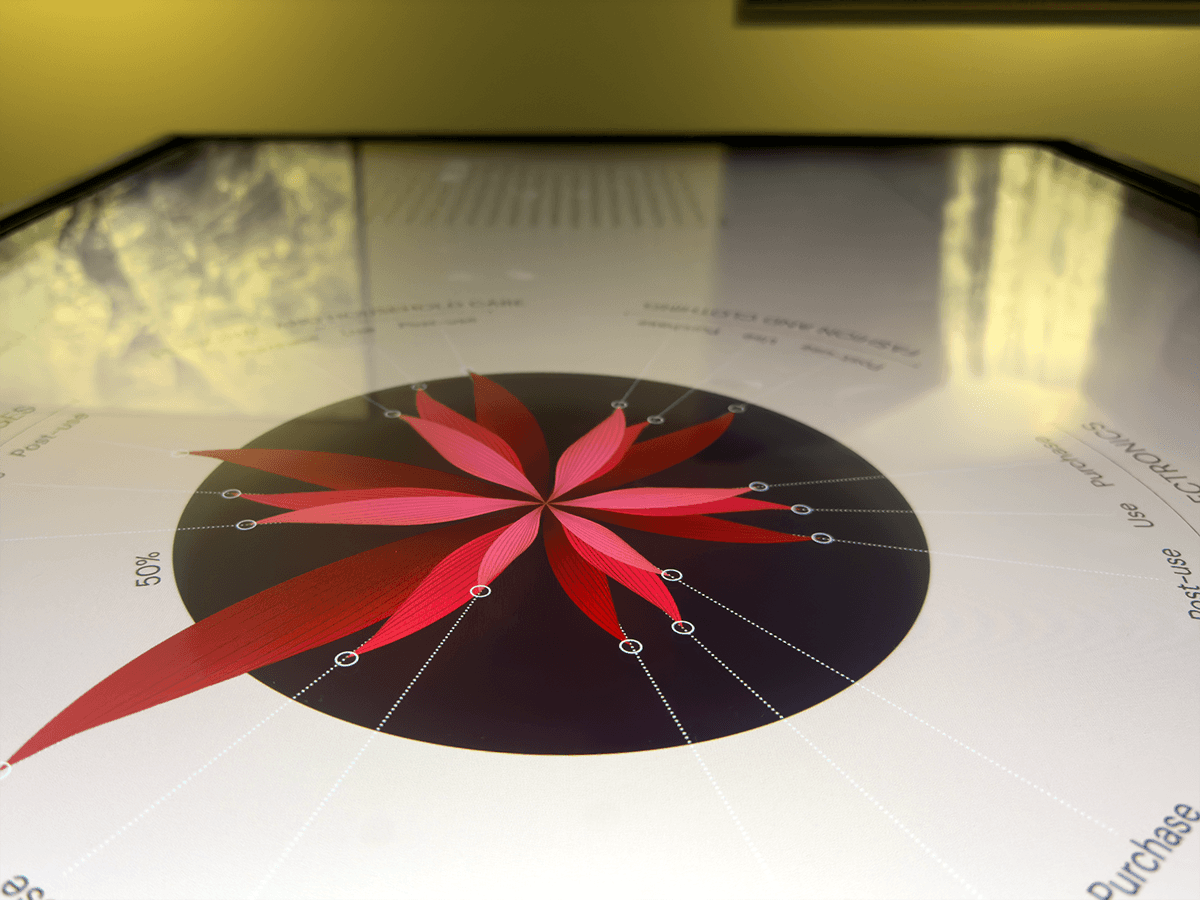
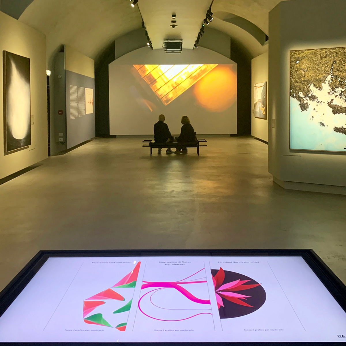
The interactive table represented the visitors' initial introduction to the world of data visualization, a relatively novel addition within the context of a photographic exhibition. Through interaction with the screen, visitors were able to delve into the potential contributions of circular solutions in reversing Earth's overshoot, the flow of materials (from raw resources to emissions) at the European level, and consumer habits regarding circularity.
The interactive screen
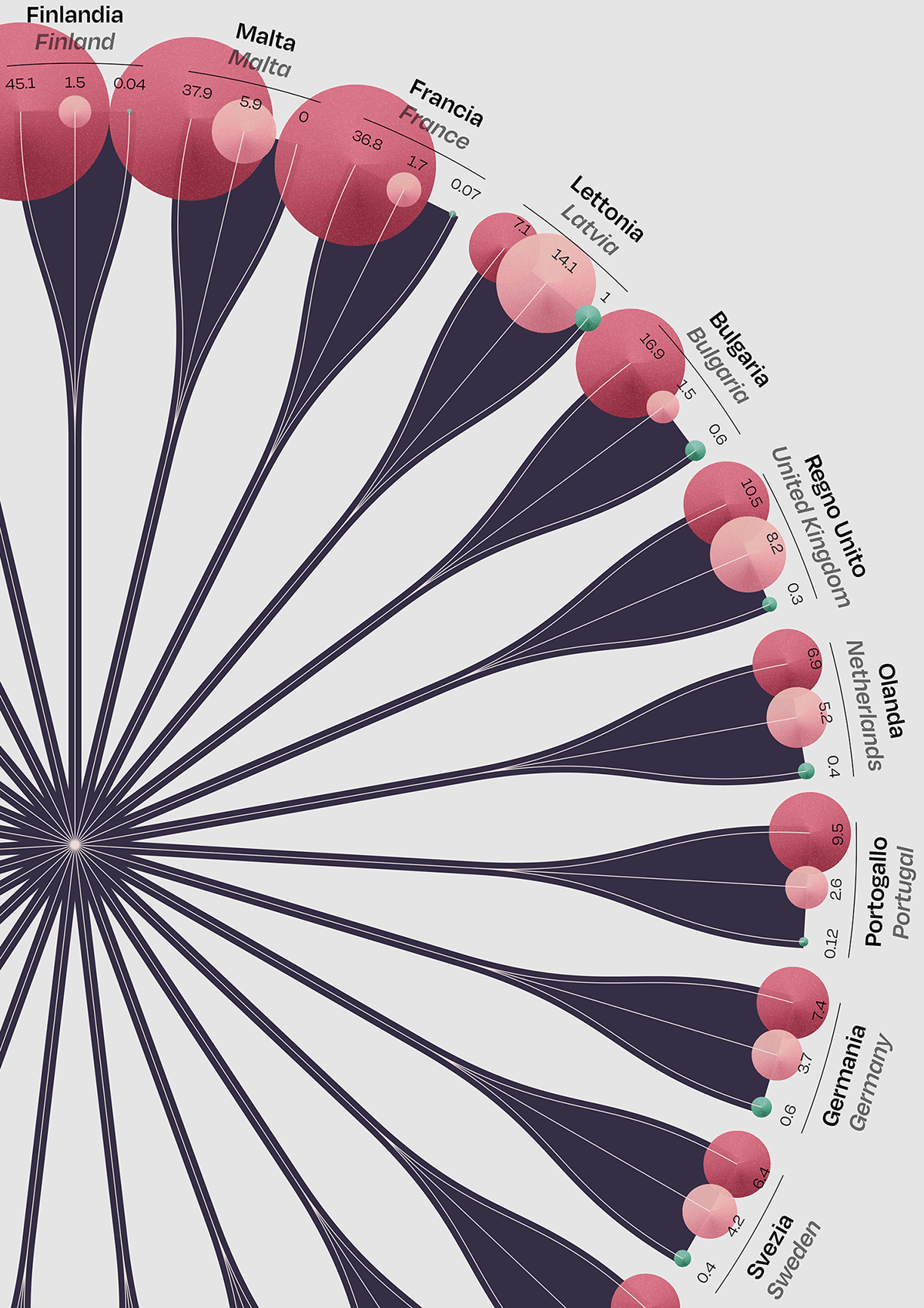
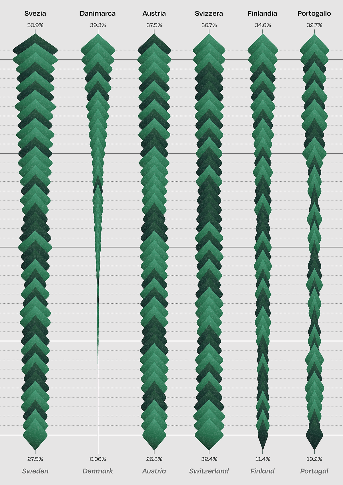
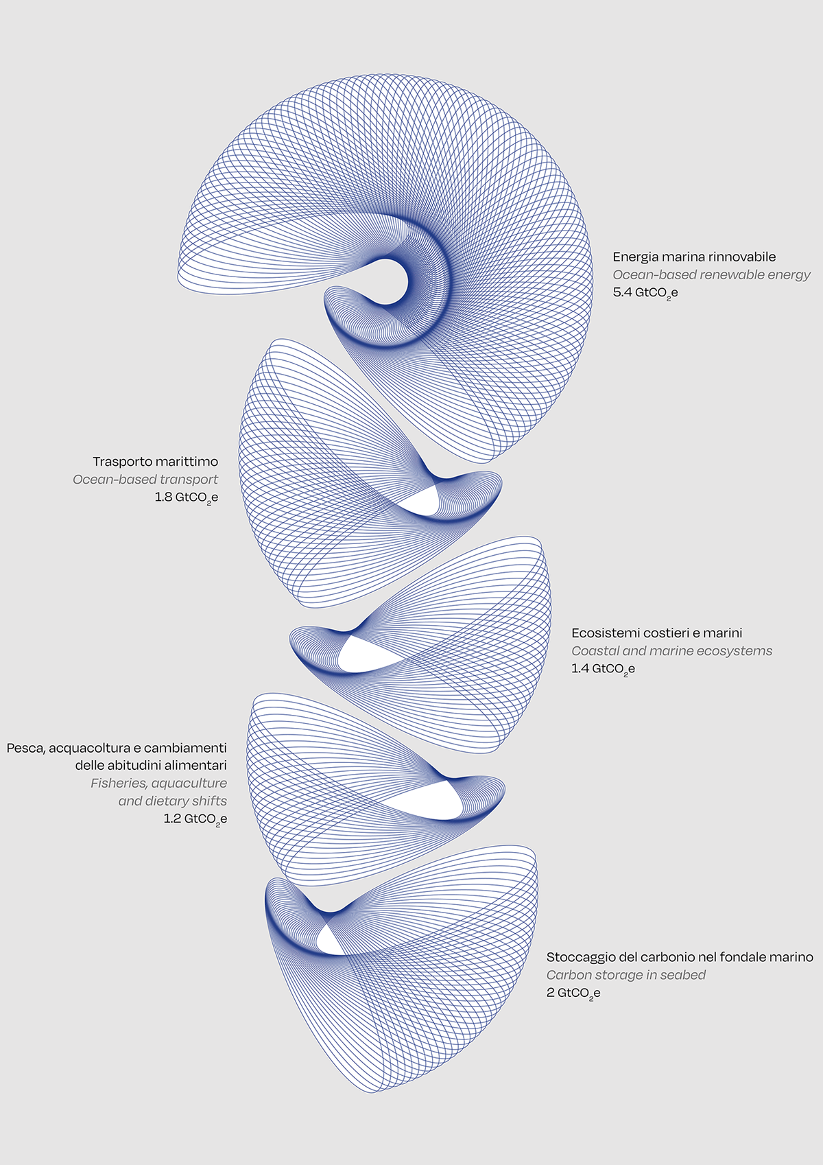
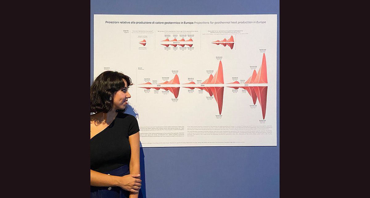
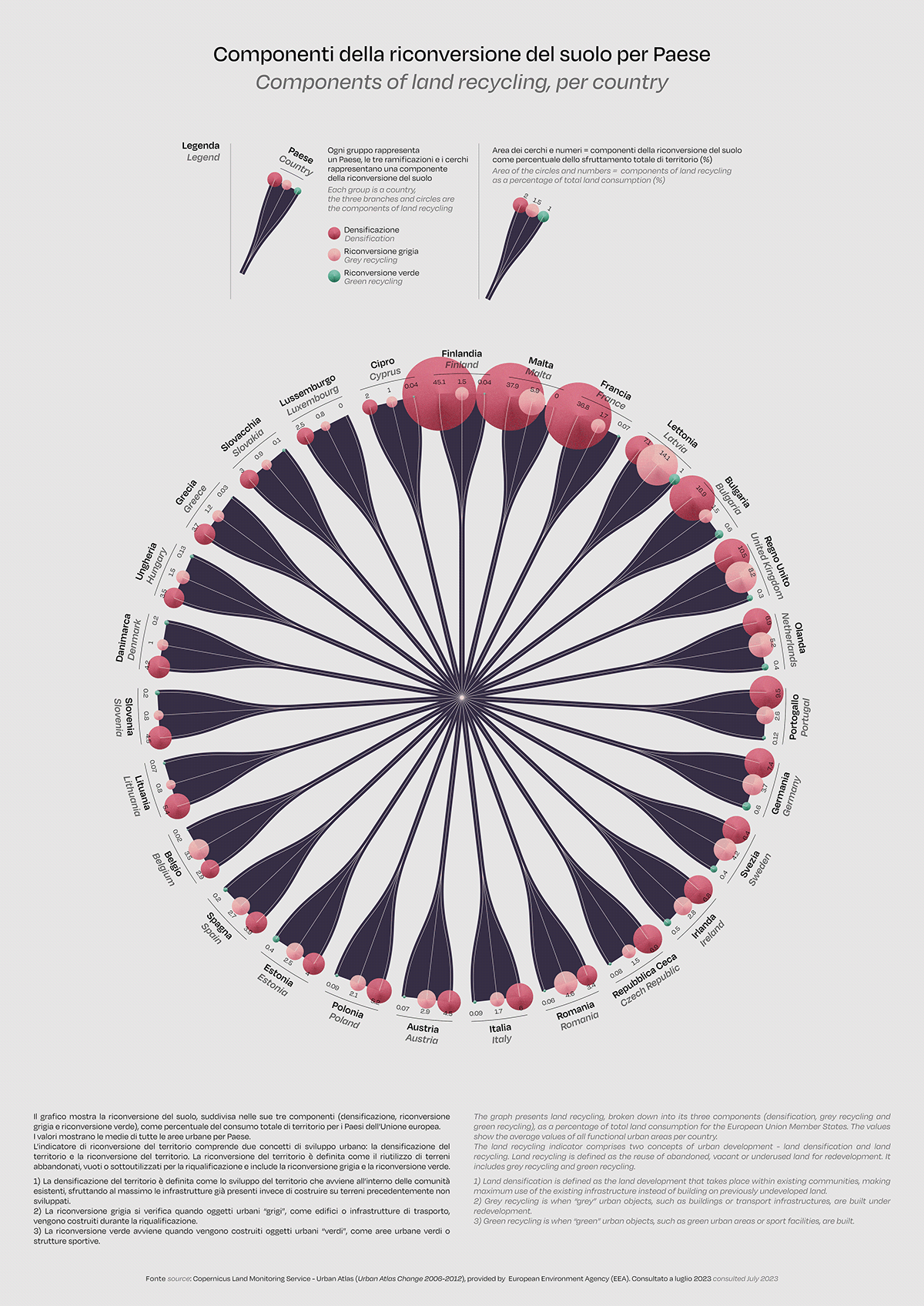
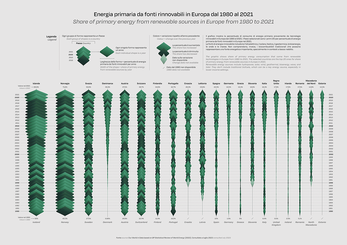
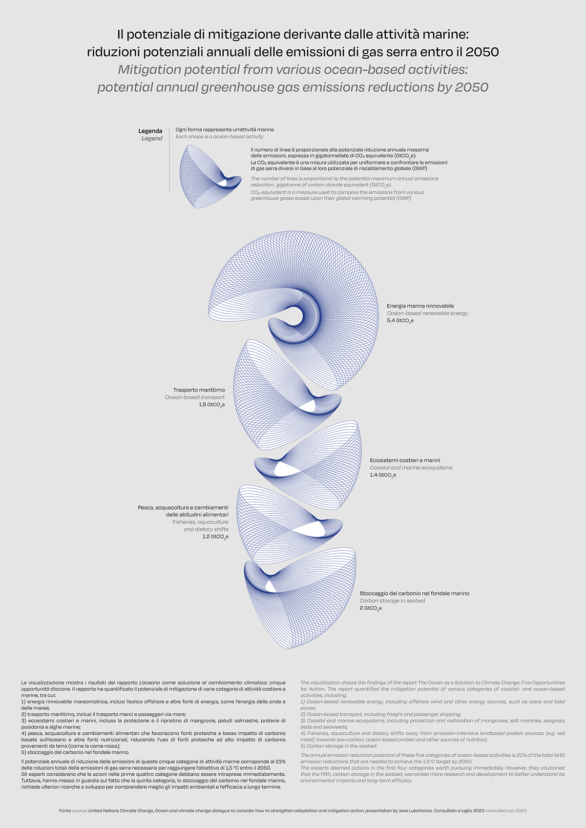
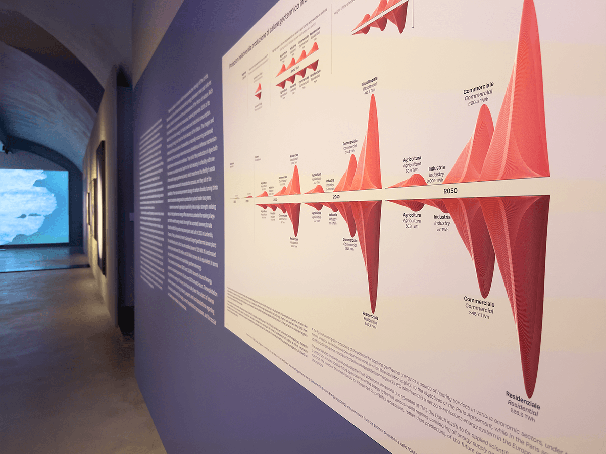
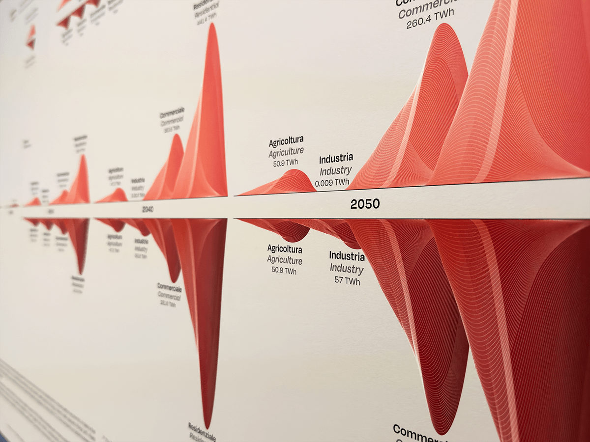
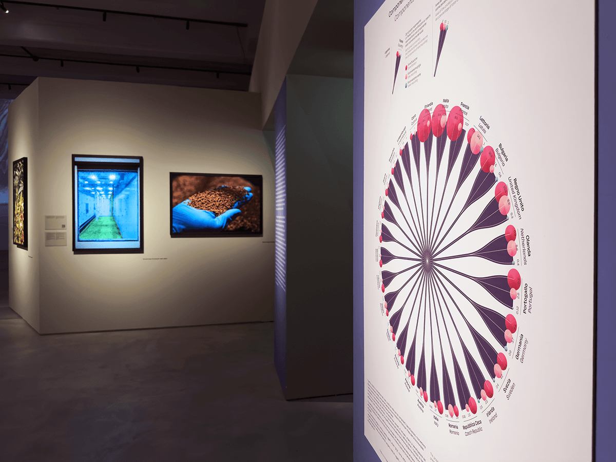
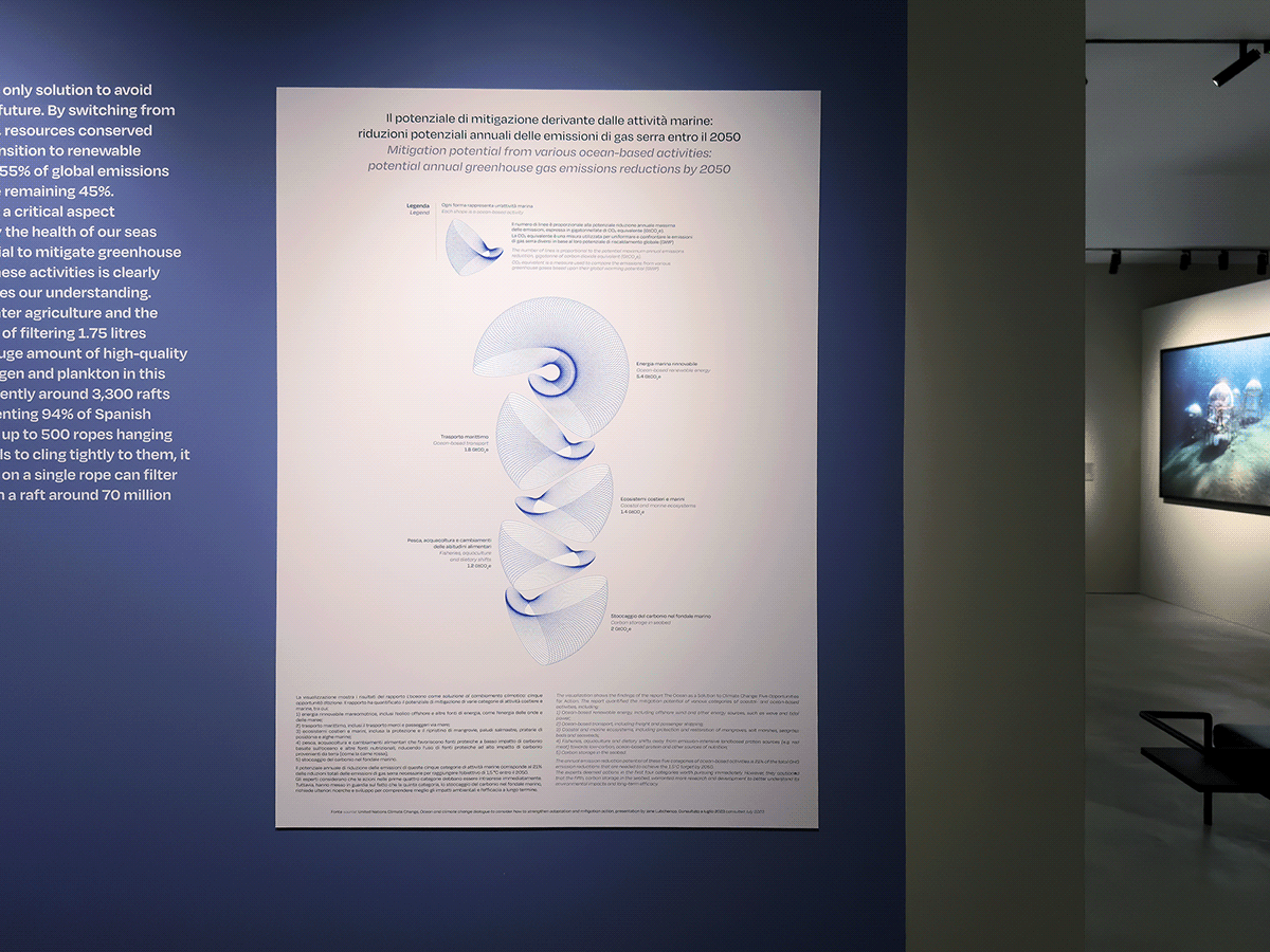
Following the interactive table, the exhibition path was characterized by five static data visualizations, which complemented the narrative thread of Locatelli's works. These pieces explored themes related to renewable energies, land recycling, and the potential of oceans.
The visualizations were crafted with the aim of conveying the complexity and multidimensionality of the information presented, incorporating the aesthetic component as an integral part of the communication process: an invitation to explore information, whether intricate or straightforward, within an artistic and museum context.

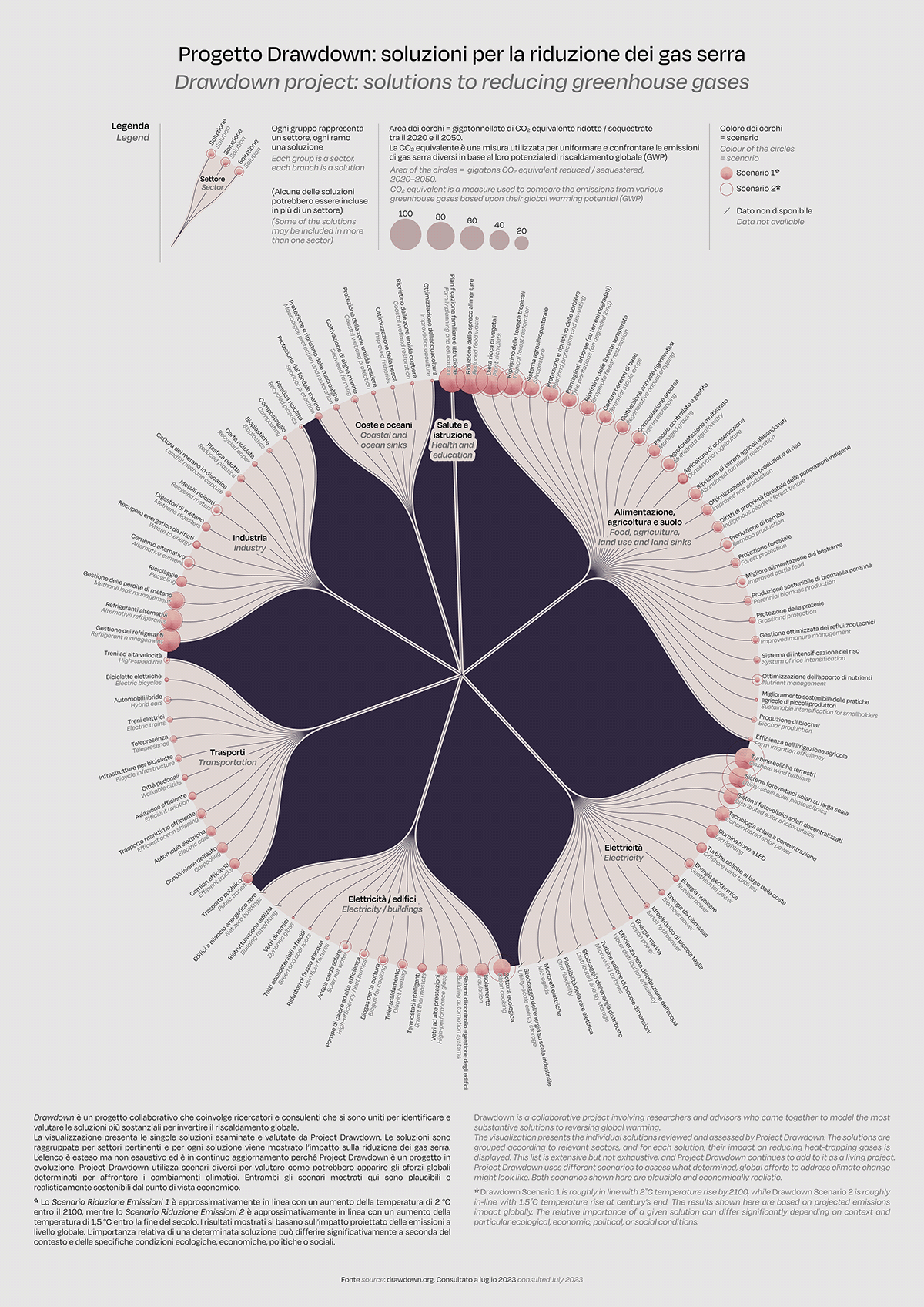
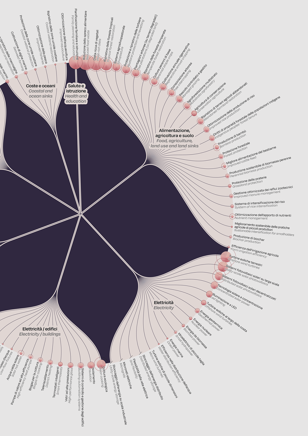
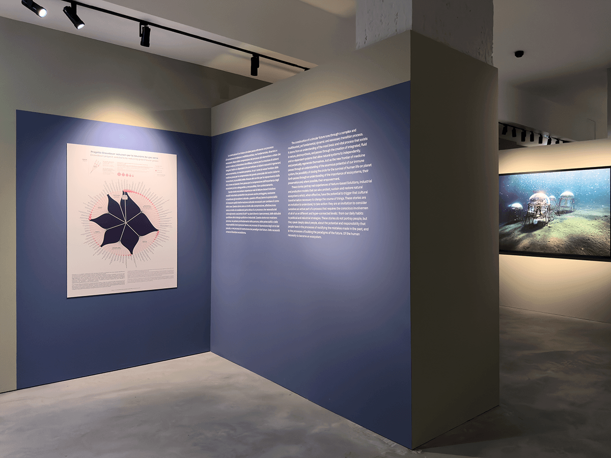
The exhibition concluded with a final infographic - the richest - which depicts the solutions proposed by the network of scientists, researchers, and fellows of Project Drawdown. The project outlines a set of more than 90 technologies and practices that collectively have the capacity to significantly reduce concentrations of greenhouse gases in the atmosphere.
The richness that characterizes the array of possible solutions concludes an exhibition marked by a strong informative and forward-looking intent.
Images from the exhibition
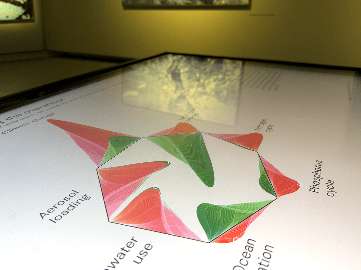

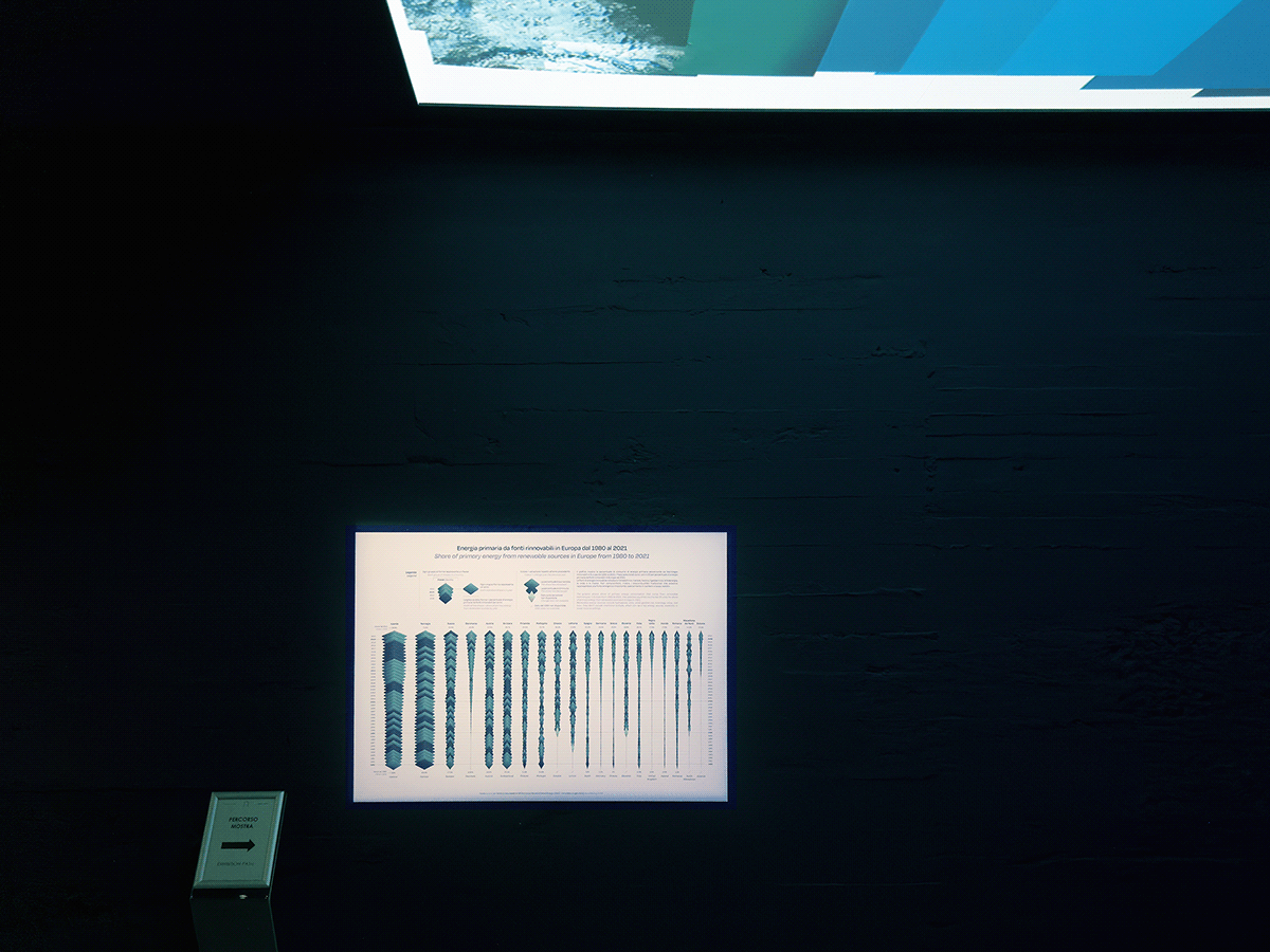
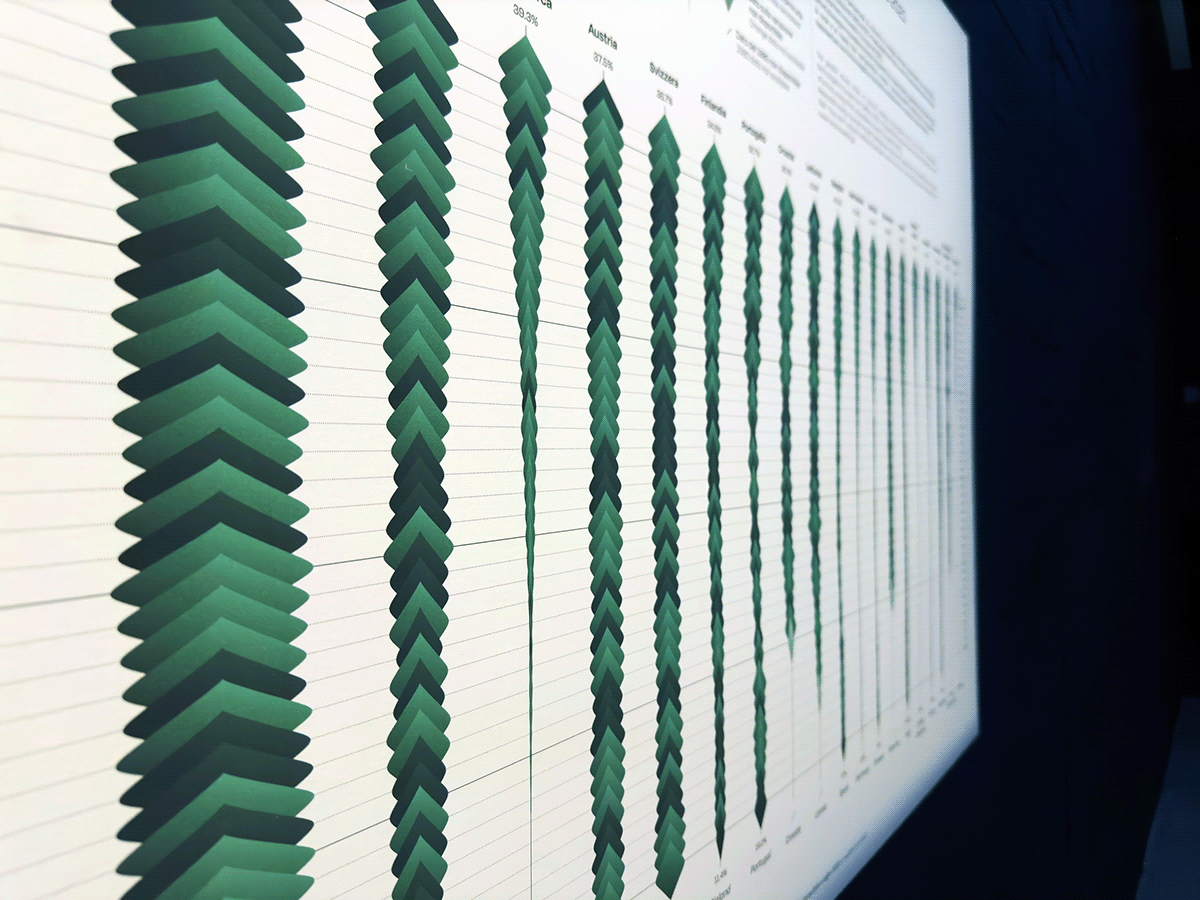

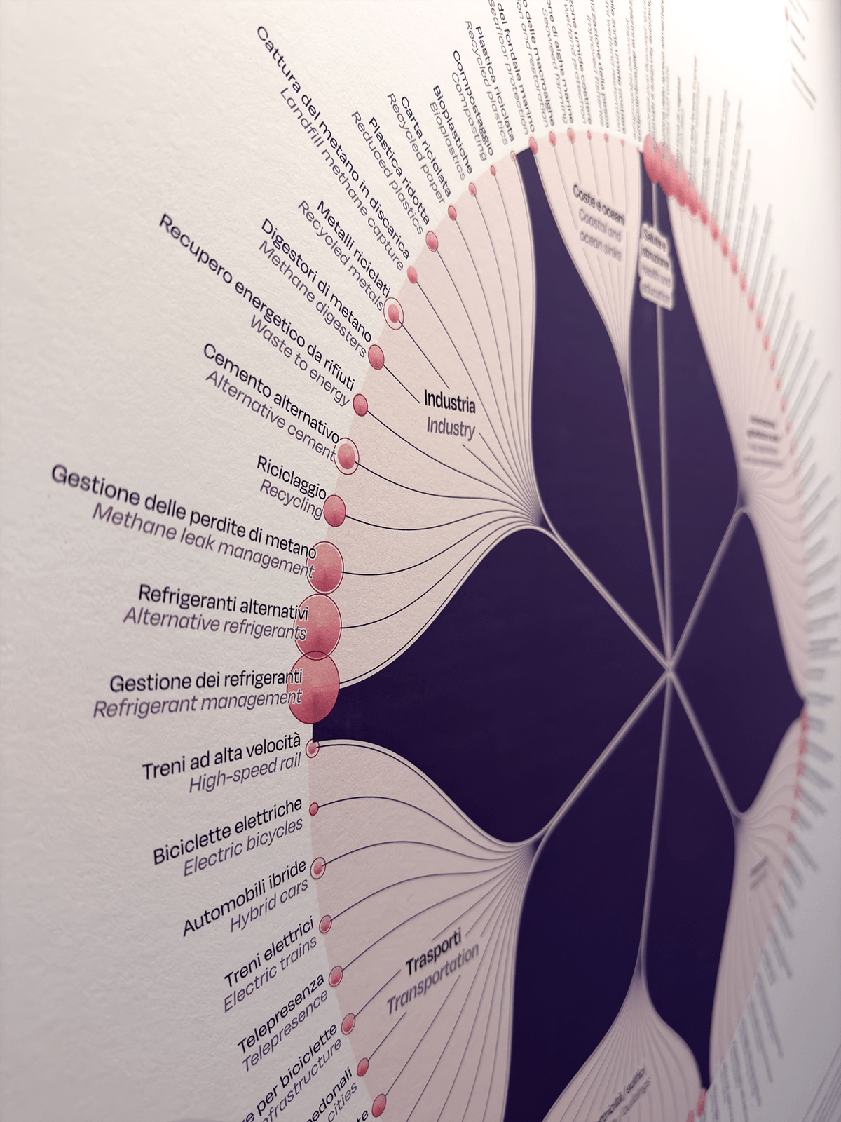
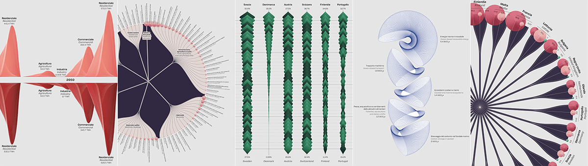
Details from the data visualizations